
What is Redacted Maps?
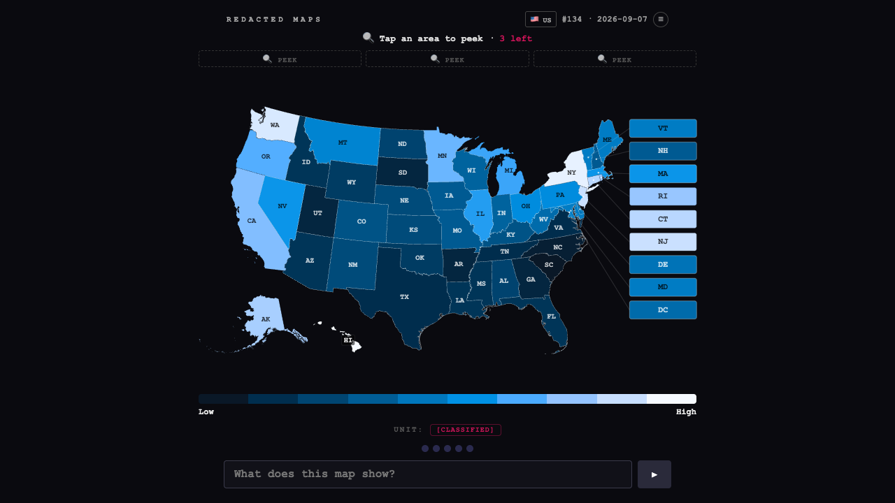
Redacted Maps shows you a colored statistical map with its title concealed. Your task is to work out what the data measures. The geography is visible; the mystery is why particular areas score high or low.
That creates a different kind of geography puzzle. Recognizing a state or country is useful, but the answer depends on interpreting a pattern across the map, such as a regional cluster or an unexpected outlier.
What information can you uncover?
The map includes a low-to-high color legend and begins with three peeks. A peek lets you inspect hidden data for a selected area. Wrong guesses gradually reveal more context: the unit after the first miss, a category after the second, and a hint after the third. The final guess becomes a choice among four candidate answers.
Hatched areas mean data is unavailable there. They should not be treated as places with a value of zero.
How to solve the daily data mystery
- Look across the whole map and note the strongest highs, lows, and regional patterns.
- Use a peek on an informative area, such as an outlier, rather than choosing a location at random.
- Propose the statistic or subject you think explains the pattern and submit the guess.
- Combine newly revealed units, categories, or hints with the map before guessing again.
- If you reach the final multiple-choice stage, eliminate options that fail to explain the visible distribution.
Tips for reading a map logically
First distinguish totals from rates. A raw count can favor populous places, while a percentage or per-person measure may produce a very different pattern. The unit clue is particularly valuable for that distinction.
Check both an area your theory explains and one it struggles with. A convincing idea should account for the low end as well as the high end. Avoid committing to a familiar stereotype when the actual map points somewhere else.