The Rise of Heat Map Puzzles: How Redacted Maps and HeatMapQuest Turn Data Into Daily Geography Challenges
Learn how Redacted Maps and HeatMapQuest turn real-world data into daily geography puzzles, plus practical strategies for reading heatmaps.
Quick Answer
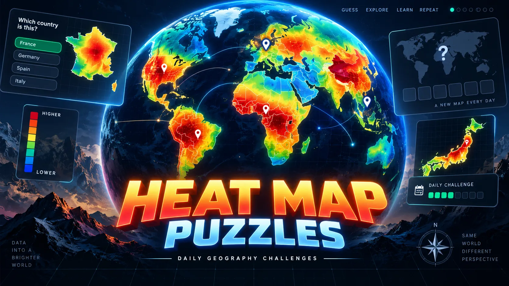
Heat map puzzles turn geography into a data-reading game. Instead of identifying a country from its outline, flag, or photograph, you study how a statistic is distributed across a map and work out what the colors mean.
Two strong examples are Redacted Maps and HeatMapQuest, but they approach the idea differently.
Redacted Maps gives you a geographic heat map with the identifying title or legend hidden. You have to infer what the underlying data represents from the pattern itself, using multiple guesses.
HeatMapQuest uses an interactive 3D globe. Each daily game contains four rounds, and every round colors countries according to a real-world statistic. You choose the correct statistic from four possible answers.
The shared skill is not memorizing every country's exact value. It is recognizing patterns such as:
large countries dominate → possibly a total measure
small wealthy countries dominate → possibly a per-capita measure
tropical regions cluster together → possibly climate, biodiversity, or forest data
wealthy developed countries lead → possibly health, income, or technology data
That combination of geography, general knowledge, and visual deduction is what makes heat map games different from traditional country guessers.
What Is a Heat Map Geography Puzzle?
A heat map geography puzzle takes a real dataset and converts numerical values into colors.
Countries, states, or regions with similar values receive similar shades. High and low values become visible as geographic patterns even when the labels explaining the data are removed.
Normally, a heat map answers a question:
Statistic → Map
A heat map puzzle reverses that relationship:
Map → ?
Your job is to reconstruct the hidden statistic.
Imagine a world map where India and China are among the strongest colors, the United States is also high, and small countries tend to be weak.
Possible explanations could include:
- Total population
- Total energy consumption
- Total internet users
- GDP
- Agricultural production
Now imagine Luxembourg, Norway, Switzerland, and Singapore become unusually prominent while India and China move toward the middle.
That looks much more like a per-capita or wealth-related measure.
The puzzle is therefore less about knowing exact numbers and more about understanding what kinds of data create particular geographic patterns.
Why Heat Maps Work So Well as Daily Games
Daily geography games traditionally hide a place.
A country-outline game asks you to recognize borders. A flag game tests visual memory. A photo game tests location knowledge. A distance game tells you whether your guess is geographically close.
Heat map games hide something different:
the variable itself.
You usually know where the countries are. What you do not know is why they have those colors.
That creates an interesting inversion of the normal geography puzzle.
Instead of asking:
Where is this?
heat map games ask:
What does this geographic pattern represent?
A single map can therefore test geography, economics, demographics, climate knowledge, public health, culture, and statistical intuition at the same time.
How Redacted Maps Works
Redacted Maps presents a daily thematic map with the identifying information removed.
The color pattern remains visible, but the title or legend that would normally explain the data is hidden. Your job is to determine what the map represents.
The geographic scope can vary. A puzzle may use a world map, the United States, Europe, Asia, Africa, or another regional view.
Some areas can also be marked as unavailable or hatched to indicate missing data.
That distinction matters.
If an area is marked as having no data, do not interpret it as:
lowest value
It may simply mean:
no usable measurement
What Redacted Maps Tests
Redacted Maps is relatively open-ended.
You are not always choosing between a few clearly defined options. You need to generate a plausible explanation yourself.
The reasoning loop is closer to:
observe → form hypothesis → guess → revise
For example, imagine a US map where several Mountain West states are very bright while much of the Northeast is dark.
Possible explanations could include:
- Average elevation
- Land area
- Population density
- Federal land ownership
- Solar potential
- Agricultural land
The challenge is not simply identifying one unusual state.
You need a theory that explains the overall pattern.
How HeatMapQuest Works
HeatMapQuest makes the same broad concept more structured.
Each day contains four rounds. Every round displays an interactive 3D globe colored according to a real country-level statistic.
You inspect and rotate the globe, then choose which statistic produced the pattern from four possible answers.
The daily challenge is shared, so players receive the same rounds and can compare performance.
The underlying statistics can cover subjects such as:
- Population
- Economics
- Health
- Environment
- Demographics
- Forests
- Development
- Infrastructure
- Land use
You usually do not need to know exact country values.
You mainly need to decide which proposed statistic would rank the countries in approximately the pattern shown.
What HeatMapQuest Tests
HeatMapQuest is more about comparative elimination.
Suppose your four choices are:
- Total population
- GDP per capita
- Forest coverage
- Life expectancy
If India and China dominate the globe, total population immediately becomes plausible.
If Switzerland, Norway, Singapore, and other wealthy countries become unusually strong, GDP per capita deserves more attention.
If heavily forested tropical regions stand out, forest coverage becomes more likely.
You solve the round by testing each answer against several recognizable countries.
Redacted Maps vs HeatMapQuest
The two games share the same visual language but create different kinds of difficulty.
| Feature | Redacted Maps | HeatMapQuest |
|---|---|---|
| Core clue | Colored thematic map | Colored interactive 3D globe |
| Main task | Identify what the map represents | Choose the hidden statistic |
| Answer style | More open-ended | Four-choice selection |
| Daily structure | Daily map puzzle | Four rounds per day |
| Geographic scope | Can vary by puzzle | Primarily country-level world data |
| Key skill | Hypothesis generation | Comparative elimination |
| Difficulty feel | More ambiguous | More guided |
| Best for | Map and data enthusiasts | Faster daily puzzle players |
Neither is simply a harder version of the other.
Redacted Maps gives you more freedom, which also produces more uncertainty.
HeatMapQuest narrows the answer space, but the wrong options can still look plausible because many real-world statistics are geographically correlated.
The Most Important Skill: Read Relative Patterns
A common beginner mistake is trying to remember exact statistics.
You usually do not need to know that Country A has a value of 74.2 while Country B has 61.8.
You need to understand relationships such as:
A > B
or:
this region should generally rank high
or:
large-population countries should dominate this measure
Heatmaps communicate relative geography extremely well.
Use them that way.
Instead of asking:
What is Germany's exact value?
ask:
Should Germany be higher or lower than India, Brazil, Japan, and Nigeria if this statistic is correct?
That is usually much easier.
Start With Anchor Countries
Do not attempt to process the entire map at once.
Choose a small number of countries whose broad characteristics you understand well.
Useful anchors include:
- United States
- China
- India
- Japan
- Russia
- Brazil
- Canada
- Australia
- Germany
- Norway
- Singapore
- Saudi Arabia
Each helps in different ways.
China and India are excellent tests for population-dependent totals.
Norway and Singapore can expose per-capita wealth patterns.
Russia and Canada help with land area, climate, resources, and population-density questions.
Brazil is useful for forest, agriculture, biodiversity, population, and development patterns.
Australia is valuable because it is geographically huge but relatively sparsely populated.
You do not need these countries to be extreme in every dataset. You use them as familiar reference points.
Distinguish Totals From Per-Capita Measures
This is one of the most useful heat map strategies.
Consider:
Total GDP
versus:
GDP per capita
They sound closely related but produce very different maps.
Total GDP favors large economies such as the United States and China.
GDP per capita can make small wealthy countries far more prominent.
The same distinction appears in many categories:
- Total CO2 emissions vs emissions per person
- Total energy consumption vs energy use per person
- Total internet users vs internet penetration
- Total forest area vs percentage forest cover
- Total military spending vs spending per capita
- Total roads vs road density
Whenever a map looks surprising, ask whether you are confusing a total with a rate, percentage, density, or per-capita value.
Use Extreme Countries Before Average Countries
The middle of a heatmap is often noisy.
A country shown in a medium shade may fit many possible statistics.
Extremes are more informative.
Suppose Iceland is close to the maximum.
Ask:
What is Iceland unusually high in?
You might consider renewable electricity, internet access, energy consumption, longevity, or another characteristic.
Then inspect other countries at the same extreme.
One outlier creates a hypothesis.
Three matching outliers create much stronger evidence.
This is particularly useful in HeatMapQuest because one answer option may fit several recognizable extremes while the others quickly create contradictions.
Check More Than One Continent
Never solve a global heatmap from Europe alone.
Many statistics are highly correlated within regions.
European countries can simultaneously score strongly in:
- Income
- Life expectancy
- Internet adoption
- Education
- Healthcare
- Urbanization
If you only inspect Europe, several possible statistics may seem correct.
Check Africa, Asia, South America, North America, and Oceania as well.
A theory that explains Europe but completely fails in Southeast Asia is probably wrong.
For HeatMapQuest, rotating the globe before answering should become automatic.
Learn Broad Data Families
You do not need to memorize hundreds of country rankings.
Learn the broad geographic signatures of common data categories.
Population and Scale
Total measures often favor countries such as:
- China
- India
- United States
- Indonesia
- Brazil
But remember that industrial or economic totals may elevate wealthier economies beyond what population alone would predict.
Wealth and Development
Many per-capita development measures tend to favor:
- Western Europe
- Nordic countries
- North America
- Australia and New Zealand
- Singapore
- Selected Gulf states
The exact ordering changes, but the overall family resemblance is useful.
Climate
Climate-related data often follows physical geography more strongly than national borders.
Look for:
- Tropical belts
- Desert regions
- Arctic countries
- Mediterranean zones
- Monsoon regions
If neighboring countries with very different incomes share similar colors, climate may be more important than economics.
Forest and Land
Forest maps create a classic total-versus-percentage trap.
Brazil may be extremely strong in total forest area.
A much smaller but heavily forested country could rank higher in percentage forest cover.
Always consider the implied unit.
Health and Demographics
Life expectancy, fertility, median age, infant mortality, and population growth often produce recognizable but overlapping maps.
Look for countries known to sit at opposite ends of demographic transitions rather than relying on one region.
Look for Geographic Clustering
Statistics often cluster geographically because neighboring countries share:
- Climate
- Languages
- History
- Trade relationships
- Institutions
- Income levels
- Natural resources
- Demographic trends
If an entire region changes color together, ask what those countries have in common.
For example:
high values form an equatorial belt
suggests a different family of answers from:
high values cluster in Northern Europe
or:
high values concentrate among oil-exporting states
Geography itself becomes evidence.
Do Not Confuse Correlation With the Answer
Heat map puzzles become difficult because many statistics look similar.
Wealth correlates with:
- Life expectancy
- Internet usage
- Education
- Electricity consumption
- Vehicle ownership
- Healthcare spending
That means a map that resembles a wealth map may not actually represent income.
Good distractor answers exploit this.
When two options seem strongly correlated, look for countries where they should diverge.
An oil-rich country, for example, may rank extremely high in income but look quite different on demographic or environmental indicators.
Exceptions are often more useful than the overall trend.
A Practical HeatMapQuest Example
Imagine a round offers four choices:
- Total population
- GDP per capita
- Forest coverage percentage
- Life expectancy
You inspect the globe.
India and China are extremely strong.
The United States is also high.
Large-population countries in several regions are noticeable.
Small wealthy European states are not especially dominant.
Now eliminate.
GDP per capita?
Probably not. India would not normally be among the strongest countries.
Forest coverage?
The overall pattern does not fit especially well.
Life expectancy?
Again, the strongest countries do not match what you would expect.
Total population?
This explains the major anchors.
You did not need to know any exact population figures.
You solved the puzzle from relative ordering.
A Practical Redacted Maps Example
Now imagine Redacted Maps shows a US state heatmap.
Much of the West is bright.
Several dense northeastern states are dark.
Alaska is an extreme outlier.
Possible hypotheses might include:
land area
population density
average elevation
federal land ownership
Because you are not simply selecting from four answers, you need to generate and test those ideas yourself.
Ask:
- What should Texas look like?
- What should New Jersey look like?
- Does Colorado fit?
- Does Alaska support or contradict the theory?
- Is the map following physical geography, population, or policy?
Redacted Maps rewards this kind of iterative reasoning more strongly than a fixed multiple-choice format.
Missing Data Can Be a Clue
If a map marks some countries or regions as unavailable, that can sometimes tell you something about the dataset.
A specialized international statistic may not be collected everywhere.
A historical dataset may omit newer states.
A particular legal or cultural measure may only apply in certain jurisdictions.
However, use missingness carefully.
No data does not mean zero.
Treat missing areas as secondary evidence unless the puzzle clearly tells you otherwise.
Why the 3D Globe Matters in HeatMapQuest
The globe is not only a visual effect.
It changes how you inspect the data.
A flat map encourages players to focus on familiar areas such as Europe and North America. A rotatable globe makes it easier to deliberately inspect regions that might otherwise receive less attention.
That can change an answer.
A theory that looks perfect from Europe may fall apart when you rotate toward Africa or Southeast Asia.
A good HeatMapQuest routine is:
inspect → rotate → compare → answer
not:
look at starting view → guess immediately
How Heat Map Puzzles Differ From Globle
Heat colors already appear in famous geography games such as Globle, but the colors have a different purpose.
In Globle, heat is primarily feedback about geographic distance. Warmer colors tell you that a previous country guess is closer to the hidden target.
In Redacted Maps and HeatMapQuest, color is the underlying puzzle data.
That changes the question completely.
Globle asks:
Where is the mystery country?
Heat map puzzles ask:
What real-world variable would create this distribution?
One tests spatial search.
The other tests data interpretation.
Why Heat Map Puzzles Are Expanding Daily Geography Games
The daily geography genre has already explored country silhouettes, flags, photographs, borders, distances, directions, capitals, airports, and travel clues.
Heat maps open a much larger content pool because almost any geographically indexed dataset can become a puzzle.
Potential categories include:
- Population
- Economy
- Trade
- Energy
- Climate
- Health
- Agriculture
- Transport
- Technology
- Education
- Environment
- Culture
- Demographics
The interface can remain familiar while the hidden subject changes every day.
That is valuable for players because the challenge can move from economics one day to forests, health, population, or infrastructure the next without changing the basic rules.
Heat Maps Reward Partial Knowledge
Traditional trivia often creates a binary experience.
Either you know the answer or you do not.
Heat map deduction gives partial knowledge more value.
You may not know the exact fertility rate of any particular country.
But you might know that fertility tends to be lower across much of Europe and East Asia and higher in parts of Sub-Saharan Africa.
That broad knowledge is enough to make meaningful deductions.
The game therefore rewards understanding relationships rather than memorizing isolated facts.
Useful Tips for Better Scores
1. Identify the Unit Type First
Before identifying the topic, ask whether the map appears to represent:
- A total
- A per-capita measure
- A percentage
- A density
- A rate
- An index
This can eliminate several possibilities immediately.
2. Use at Least Three Anchor Countries
Do not trust a theory because it explains one country.
Test it against three or more familiar countries, ideally from different regions.
3. Search for Contradictions
Instead of asking only:
Why could this answer be correct?
ask:
Which country should look completely different if this answer were correct?
Disproving options is often easier than proving one.
4. Compare the Extremes
The brightest and darkest countries usually contain more information than medium shades.
Start there.
5. Rotate Before Answering
In HeatMapQuest, inspect multiple continents before committing.
6. Expect Correlated Statistics
A developed-country pattern could represent income, health, technology, education, or consumption.
Look for countries where those indicators diverge.
7. Respect Missing Data
Hatched or unavailable regions may mean there is no measurement, not that the value is extremely low.
8. Use Broad Geography Before Exact Facts
Knowing that a country is tropical, wealthy, sparsely populated, mountainous, oil-rich, or rapidly growing is usually more useful than memorizing one exact statistic.
Which Game Should You Start With?
Choose HeatMapQuest if you want a fast and approachable daily game.
The four-choice format lets you solve rounds through elimination even when the dataset is unfamiliar, and the four-round structure provides enough variety for a short daily session.
Choose Redacted Maps if you want a more open-ended puzzle.
Because you need to infer the subject rather than simply select from a short list, it rewards curiosity, experimentation, and hypothesis generation.
A useful progression is:
HeatMapQuest → learn common data patterns → Redacted Maps → practice open-ended interpretation
Players who already enjoy thematic maps, demographic statistics, election maps, economics, or data visualization may prefer Redacted Maps immediately.
Who Are Heat Map Puzzles Best For?
These games are especially suitable for players who enjoy:
- Geography games
- Maps and atlases
- Data visualization
- World statistics
- Economics
- Demographics
- Climate and environment
- Pattern recognition
- Deduction puzzles
- Daily browser games
They are also a good alternative for players who are tired of geography games based mainly on flags or country outlines.
You do not need to be a data scientist.
The most useful question is simply:
What do these places have in common?
Are Heat Map Games Educational?
Yes, but mostly through repeated comparison rather than memorization.
A good round teaches relationships between countries.
You might discover that a country you assumed was wealthy performs unexpectedly on a health measure, or that a geographically huge country ranks surprisingly low when a statistic is measured per capita.
When a result surprises you, the natural follow-up question is:
Why does this country look like that?
That is where a short daily game can become a useful geography lesson.
Final Take
Heat map puzzles are a natural next step for daily geography games because they turn the map itself into evidence.
Redacted Maps asks you to reconstruct a hidden dataset from an unlabeled thematic map. HeatMapQuest turns the same core concept into a faster four-round multiple-choice challenge on an interactive globe.
The best way to improve at either game is not to memorize more exact statistics.
Learn to recognize families of geographic patterns:
total vs per capita
wealth vs population
physical geography vs human development
tropical vs temperate
large country vs dense country
regional trend vs meaningful outlier
Once you begin reading maps that way, the colors stop looking like decoration and start behaving like clues.
That is what makes heat map puzzles compelling: the same familiar world map can hide an almost unlimited number of questions, and solving them requires you to connect geography with how the real world actually works.